When to refresh your brand — and when not to
A practical guide to help businesses know when the time is right to refresh their brand, protect heritage and create a visual identity that works today.
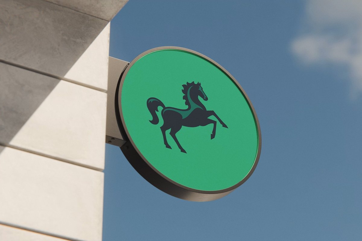
Signage for Lloyds Bank by Wolff Olins and collaborators
“We need a new brand.”
Have you recently made that statement? What made you say it? Do any of these scenarios sound familiar:
Are you struggling with inconsistency across your marketing?
Is your visual identity no longer resonating with your target audience — maybe because your business has evolved?
Do you want to modernise for digital platforms (website, social media, app) without losing what makes your brand distinctive?
If the answer to some or all of the above is yes — and you can clearly articulate “why” — then a brand refresh can be a smart strategic move for your business.
But it’s really important to highlight that a brand refresh isn’t just about making things “look nicer.” Design without purpose is just design for design’s sake, it misses the point and it will miss the mark.
Whereas, when done right, a brand refresh helps a business reconnect with its purpose, better reflect who it is — and attract and engage the right audience. Before you start thinking about logos or colours, ask yourself: what problem am I trying to solve?
To help illustrate what a succesful brand refresh looks like, we’ll consider some UK household names who have refreshed their identities in recent times, Lloyds Bank and Royal Albert Hall.
The before and after logos for the Royal Albert Hall.
Case Study: The Royal Albert Hall
In the words of Brandpie who led production of the new identity, The Royal Albert Hall had become an iconic yet visually fragmented brand. Over time, multiple logos and sub-brands diluted the strength of the core brand.
The solution? To produce a unified identity rooted in heritage — but optimised for a modern, digital-first world.
A new ‘masthead’ inspired by Victorian-era letterforms was produced with subtle nods to bold 1960s/70s poster design. The result feels timeless — equally at home on a classical concert poster or a modern rock gig campaign.
Masthead design for Royal Albert Hall by Brandpie and an internal team at The Royal Albert Hall
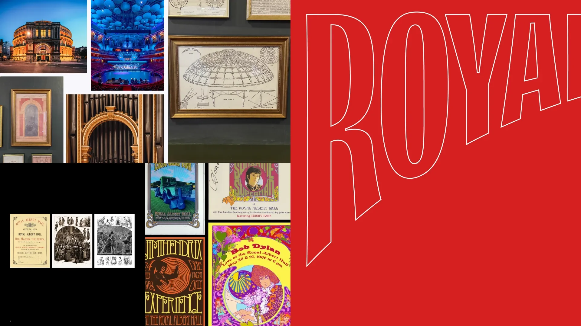
The new masthead was inspired by the Hall’s past but applied for us in a modern, engaging way.
They also replaced inconsistent reds with a single, strong “Royal Red,” and adopted a modern, clean typeface (Aktiv Grotesk) to give the brand a contemporary voice.
Importantly — they didn’t try to reinvent what the Hall is. Instead, they “amplified what makes the Hall amazing.” The refresh respected the Hall’s history while positioning it for a broader, younger, more diverse audience.
Whats the lesson? You don’t necessarily need to throw everything out. A brand refresh can be about clarifying, refining, and amplifying — not erasing your past.

Case Study: Lloyds Bank
Lloyds recently undertook a major rebrand led by Wolff Olins (with help from creative agency adam&eveDDB and others) as part of a broader shift to become a digitally-focused, “experience-led” brand.
The before and after horses for Lloyds Bank.
They kept their historic green colour and the iconic black horse — but updated both for modern applications. The horse now faces forward (symbolising progress), and the visual identity includes a refreshed colour palette, custom typeface, a new tone of voice, and modern illustration/photography style.
The refresh was about more than aesthetic: it supported a major app relaunch (their new customer banking app), signalling the organisation’s pivot toward digital services and modern customer experiences.
Their new brand platform — summarised by the slogan “Lloyds moves everyone forward” — shows how a strong repositioning can be tied to identity changes without losing the core brand DNA.
Whats the lesson? When you redesign brand identity, think about how it will support your business’s future direction — especially if you’re shifting services (e.g., from traditional to digital, in-person to online) or targeting new customers.
Key principles for a succesful brand refresh
Start with purpose, not aesthetics. A refresh should solve real problems — clarity, consistency, audience alignment — not just make things “look new.”
Respect what already works. The strongest identities (like Royal Albert Hall and Lloyds) evolve rather than erase. Good design builds on your existing reputation, values and strengths.
Design for modern use. Your brand must work everywhere — website, social, emails, print — and be flexible enough for future growth.
Bring in expertise. A professional brand designer can reveal what truly defines your brand, translate your heritage into a modern identity, and ensure everything looks cohesive across all touchpoints.
What are your next steps?
Step 1: Review your current brand honestly. Gather your logo, website, social posts and printed material. What feels outdated or inconsistent? What still represents you well?
Step 2: Clarify your direction. How has your business evolved? Who are you trying to reach now? Clear answers here shape a meaningful refresh.
Step 3: Work with a brand designer. A specialist can guide you through the process, help you retain what matters, modernise what doesn’t, and ensure your identity works seamlessly across digital and physical channels.
Step 4: Roll out the refresh in a logical, manageable way. Prioritise high-visibility items like your website and social assets, then move to the rest. A designer can help you plan this realistically to minimise disruption.